Saturday, 24 June 2023


Pictorial Composition 
Lesson 1 and 2 reflection 

First weeks assignment presented a vast number of challenges but really helped me break down the true essence of an image and how to compose more clear and readable concepts.


The second week was an opportunity to explore those concepts and put them into practice for my projects and pieces. I tried to tell a clear story with each value sketch with bold and confident decisions. 


Sunday, 8 August 2021

Learning about the basics of composition and what It means to be a film maker


Recently I've finally managed to find some time to pick up and read this book that so many visual storytellers and creatives have recommended. So far it has been a really insightful and informative read with great easily digestible examples of what you need when creating a film. 

The key elements I took away from the first few paragraphs in the introduction is that now anyone can shoot a film with their phones and camera as technology has become more accessible and affordable as well as user friendly with high quality editing software etc. It is also much easier to learn specialized skills in film making with the aid of the internet and affordable learning.

In the same chapter the author address some key influential directors too such as: Griffith, Welles, Godard, Kurosawa and Wes Anderson just to name a few. Few of these names I have heard of and have watched their master pieces, however I am yet to discover more formidable influential directors that have made a mark in the art of film making today.

The next section of the book addresses the importance of the Visualization process, it is noted that a film enables the audience with the feeling of being present that photography or a painting cant provide. Through the visual arrangement of perspective and movement of camera. During the visualization stage the author does express the importance of being open minded during the filming and to be prepared to change and deviate from any initial storyboards or key frames. He then gives an insight to the role of a production designer and art director with clear description of their main differences during production.

Mise-en-scene is a term that I'm quite familiar with due to my earlier studies in visual communication and media in school. The initial idea that I believe it signifies is the overall design of a scene or set with a clear communication of what mood or atmosphere the visual director wants in the shot. 

It stated that the Production designer does have more of a comprehensive role than that of an Art director as they are more involved with the overall shot and flow of each scene and how the scenes is visually composed. Where as the art director will often manage the art team to come up with visual concepts for director. Gone with the wind seems to have had an influential part in the development of this role and the position of production designer has continued to be a significant role in production till this day.

 Following that the next section describes the role of the Look dev team and what their significant roles are. The teams is commonly divided into three groups, Concept Art, Plans, Elevation and Projection and finally the Storyboards and previz. There is mention of key influential production artists such as Ralph Mcquarrie and Craig Mullins who are my absolute idols when it comes to concept art and world building, along with many other great designers out there who have been a huge influence on my work.

Anyway that concludes of how much I have manage to get up to so far and with that I end this post here and continue to read on and hopefully update these entries as I intern new information.


Sunday, 7 February 2021

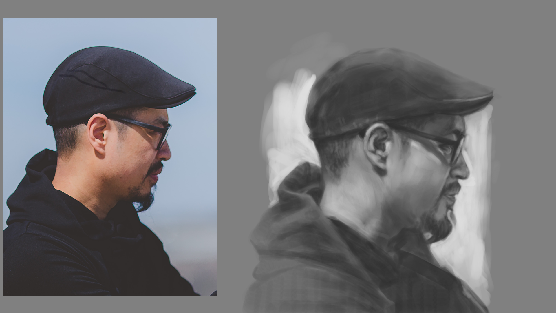
Digital Painting Lesson 7 with Bobby Chiu: Speedpainting


Part of the challenge for this assignment was to try and capture as much of the reference image within 20min as accurately as possible. I feel satisfied with the result however I feel I should have gone more with hard edged brush with high opacity before committing to any subtle value transitions. Twenty minuets was challenging but a good indication of where my painting time can be used more efficiently and effectively. One main thing I definitely took from this exercise is to focus on the speed of thinking and not how fast we execute with a brush but rather how we apply strokes more efficiently without having to backtrack and fix errors frequently.

Sunday, 31 January 2021

Digital Painting Lesson 6 with Bobby Chiu: Sketching (20


The objective of this assignment was to practice digital sketching for 20mins from reference and capture the value structure and essence of the subject.


Ref


20 min sketch

For this first 20m sketch I particularly struggled with identifying the form of the microphone and feel I should have put more time in that first. 
However I feel I got the feel and structure of the boy singing pretty well considering that I usually struggle with profiles. 
Ref:02


Sketch:02 

Overall I feel I have captured the gesture and form of this bird in the 20min i set myself. However I feel I could have simplified and give the background a bit more clarity and shape.

Ref:03
Sketch:03

The third subject matter I felt the most excited yet some what challenging as it had clear figures in the shot. I love the composition and how the values are structured, which I feel I could have pushed more and add a tiny bit more contrast and separation of values.


Ref:04
Sketch:04

The last 20min sketch I struggled the most and felt that I did not have a clear focal area. I consider it to be possibly the most challenging out of the four due to the complexity of forms and architectural environment. However i had a lot of fun and was the most rewarding trying to tackle the image.


Monday, 25 January 2021

Digital Painting Lesson 5 with Bobby Chiu


For this assignment our task was to paint from this reference for 7 days each day making different artistic choices and trying to gain as much knowledge. 

Day 1 was to paint the reference accurately using values from a base silhouette and practicing subtle gradation utilizing opacity and flow to apply confident smooth transitions and planes changes.
 
Day 2 was to accurately replicate the reference with good proportions and values without the aid of a base silhouette.

Day 3 assignment was to paint the reference again with limited time and less time looking at the image. It also gave me the opportunity to experiment with stylistic proportions.
Day 4 was undoubtedly one of the most challenging as it involved painting the subject matter flipped or mirrored without changing the orientation of the reference.
Day 5 bestowed the challenge of now adding colour on top of that flipped too. Which added extra difficulty and I found most challenging out of the days.
Day 6 was one I had most fun with as it gave me flexibility to experiment with proportions and have fun stylizing the shapes with out becoming to attached to the reference. 
Day 7 was the most exciting and somewhat challenging as it involved painting entirely with no reference and the freedom to paint the subject entirely any artistic integrity. It was a great opportunity to experiment with my subject matter and practice applying fundamental concepts.  

Saturday, 16 January 2021

Digital Painting Lesson 4 with Bobby Chiu: Colorizing Black and White


This was the second time ive have completed this assignment. The first time I attempted this class was back when I was still studying in Vancouver. I find this painting process to be some what challenging due to the fact that when colorizing the image you also need to be aware of the saturation and value beneath and may need to be adjusted to achieve the results or vibrancy I'm looking for. Each process has its pros and drawbacks however working from greyscale to colour does enable great flexibility as and easier to build a strong foundation and structure without the distraction of colour to early on. Working in values also has the benifit of a non-destructive element as you can easily adjust the tones with adjustment layers without losing detail or information underneath. Sometimes I often find my self overpainting same areas with layers of paint too many times without making a conscious decision about why I placed that colour or value. Working for greyscale helps me to break down the individual elements and gradually work the image up without getting to overwhelmed in the process.

Saturday, 9 January 2021

Digital Painting Lesson 3 With Bobby Chiu


 For lesson three our tasks was to paint using only the hard round brush on the adjustment layers with flow/opacity. Both studies limited to only hour each without any breaks was a great test of my patience and concentration to gradually build the transitions slowly and with accuracy with confident brushwork and mark making. I particularly quite enjoyed this process of painting however had a difficult time distinguishing mid tones and areas of  what should be in the light group and shadow.

Overall this was a fun exercise and a great way to revisit some basic foundations and use of the brush tool.


Sunday, 3 January 2021

Lesson 2 Digital Painting with Bobby Chiu


 The second assignment of Bobby Chiu's class was split into a 2 part painting exercise, learning how to apply subtle value transition using only flow and opacity to make make smooth gradation, which was also a great opportunity to practice edge control. The challenge was to utilize only the hard round brush and no soft or textured brush to achieve certain soft gradations. 

I found the flower petals and the ear to be quite challenging and feel I could have pushed the lighter tones further to increase the contrast and definition of the form to achieve a clearer graphic statement.
I found painting the flower petals to be the most enjoyable out of the three subject matters due to its range of values and the flexibility to pushed the lights and dark accents. 

Monday, 28 December 2020

End of 2020 and revisiting fundamentals


Digital Painting with Bobby Chiu: Lesson 1 

Brush Basics and getting familiar with digital painting.


This assignment was a great test of my confidence in my brush strokes and using only the hard round brush to blend without the aid of soft or smudge brushes. The biggest challenge in this assignment was that we could only use the swatches of values provided in the pdf and optimize flow and direction to achieve a nice blend of tones. This exercise also taught me the value of of just using hard round brush to maintain crisp solid edges before developing any further minor details or strokes with the transitions of values.

Further more i found this exercise to be a great warm up before getting to my painting for the day and great for exercising those muscles as well as to just experiment with brush control. Personally i discovered that I'm more confident painting diagonally or horizontally than vertically using big strokes at the beginning and slowly adding tighter transitions of detail. Broad strokes then cut into with either eraser or another value of paint to make more confident marks without worrying about edge control. Optimizing the flow of paint has really changed the way I control and move the paint around the canvas. I found that I like to stick within the 10%-20% flow range as I feel most comfortable when blending paint together also avoiding extreme value changes has helped with blending values. This has also taught me that everyone has a different level of sensitivity they are atoned to or comfortable with when painting. This assignment was very insightful and quite challenging, however I look forward to taking everything I learned from this lesson and applying it to my future work as I start to hone in my process.


I applied this technique of using one hard round brush with optimizing flow and opacity on my own studies to build my own confidents in the strokes and develop my brushwork and brush control. I learned a great deal but also found it super challenging to achieve the results I was looking for. 

Sunday, 22 November 2020

Sorrolla Study: Painting Colour Comps


For this study I mainly wanted to focus on the colour and light composition and capturing how the artist has grouped the values. I particularly struggled applying the transition of values working straight in colour and conveying the hue shifts that's convincing and aesthetically pleasing.

Saturday, 14 November 2020

Joaquín Sorolla study and exploring colours and value range


This Sorolla painting proved to be honestly very challenging for me to replicate his use of colour and painterly brush textures. This study gave me the opportunity to dive in and experiment a bit with the brush properties that was both enjoyable and eye opening to achieve a range of interesting effects and and quality to the surface. The dynamic colour option I particularly had fun playing with. 

Saturday, 7 November 2020

Another study of Joaquin Sorrolla work.


Been picking away at this piece for the last 2 weeks or so. The goal with this study was to the capture and copy as much as I possibly could without relying on too many digital tricks. Experimenting with the brushes to get quality and feel of real paint. I particularly struggled with capturing the saturation around the face but overall I am pleased what I have managed to accomplish with the piece.

Saturday, 24 October 2020

Getting back to greyscale painting


In continuing studying from Sorolla paintings, this week I committed to just painting one of his works in greyscale with the three value approach method and gradually building on top. This non destructive process allowed me to more experiment with the mixer brush without loosing the over form and structure of the piece as I was intent of where I put my first two values focusing on the light and dark shapes. I really like this process as it helps me to commit early on not get bog down trying to figure out the lighting and composition halfway through a painting. It really gets you to build a good foundation first to paint on top of and gradually build up. Next week my intention is too continue building on greyscale painting. 

Saturday, 17 October 2020

October Artist Study_ Joaquín Sorolla


Recently had the urge to get back into studying master's of the past, so I decided  for the remainder of this month I would look and analyse the works of Joaquín Sorolla and his masterful paintings, in attempt to learn his approach to colour and composition and his methods of grouping values when composing a pleasing image. I feel as though I have learnt a great deal from this experience and still have a lot more to learn about the theory behind light and colour. 

What was most notable about this painting is about how the artist effectively made use of subtle hue and temperature shifts and in the wide range of colour particularly in the figures jacket as well as other surrounding areas in the piece. I also really like how he has made the distribution of his shapes with in a square image canvas which I often find difficult to work with. 

Overall I am pleased how much I was able to accomplish in the week and what I got out from this  artist. I would say the area I most struggled with was identifying the form of the subjects hands and keeping transition of values subtle yet recognisable. The other area would be sleeves where I could pick out subtle greenish grey tones and yet not make it too jarring or prominent to the viewer.

In the coming in weeks I plan to look at more of Sorolla paintings and try to see what more I can pick out from this great master. Perhaps maybe look into how he construct his values, by producing a series of black and white or greyscale studies of his painting.

Saturday, 15 August 2020

Process and Approaches to painting


This assignment got me to explore a range of techniques and approaches to painting digitally. This was the first lesson of Sam Nielsen's lighting for story class. I fully enjoyed this exercise and experimented each process by combining a variety of steps and mixing them together to develop new approaches of painting that is both efficient and flexible leaving enough freedom for creativity. 

Sunday, 21 June 2020

Hatching Light and shadow


This assignments was a review on indicating shadow and light by a method of directional hatching and building forms by following the contours of the figure, each study was roughly 45min. The biggest challenge was getting the strokes to describe the direction of the structure of the plane and hatching with consistency as well as with confidence and intent without loosing any of the underlying foundation. I thoroughly enjoyed this assignment and would definitely come back to doing these exercises again in the future as a warm up. It has been a different experience as this method of building form and light has been new to me and something that i wish to continue perhaps implementing in future pieces. Further more continue to develop and build on as i experiment more with this kind of technique and approach.

Hatching Gradients


Practising hatching gradients on these figure silhouette was a great exercise that i would recommend both beginner and seasoned artist try and attempt. It requires paying great attention to how you control the lines and thickness of your strokes whilst attempting to achieve a soft and calm transition of values from dark to light or vice versa. The biggest challenge for me was achieving a smooth gradient with no overlapping dark lines or indecisive stokes without having rough edges. If I was to tackle this assignment again in the future, I would possibly tell myself to be more conscious about the way I apply my strokes and take into account of the direction of the strokes and the density of the lines. I particularly noticed that i struggle doing these digitally and that pencil would be a much easier tool to get the lightness i wanted. 

Monday, 25 May 2020

Hatching_Figures


This exercise was from a class on schoolism on deconstructing figures and anatomy. The aim and goal of the task is to practice hatching strokes to build form and volume with certain directional mark making to describe shapes and simplify the figure to its simplest and clear silhouette. I found it fairly challenging and difficult on what direction of the marks should chosen as intention of what should be defined and essential to communicate. Next is to practice building values through hatching and building form with density of strokes, which something i have never tried tackling before and is out of my comfort zone. The best thing i took away from these assignments was the importance of observation and the skill to visualise any subject to its most basic forms.